Department of Defense
Department of Defense
Principal Designer: Danielle Cerceo
UX Designer: Asha Bhakta 🥳
Developer: Ajax Abernathy
Copywriter: Laura Quaglio
the story
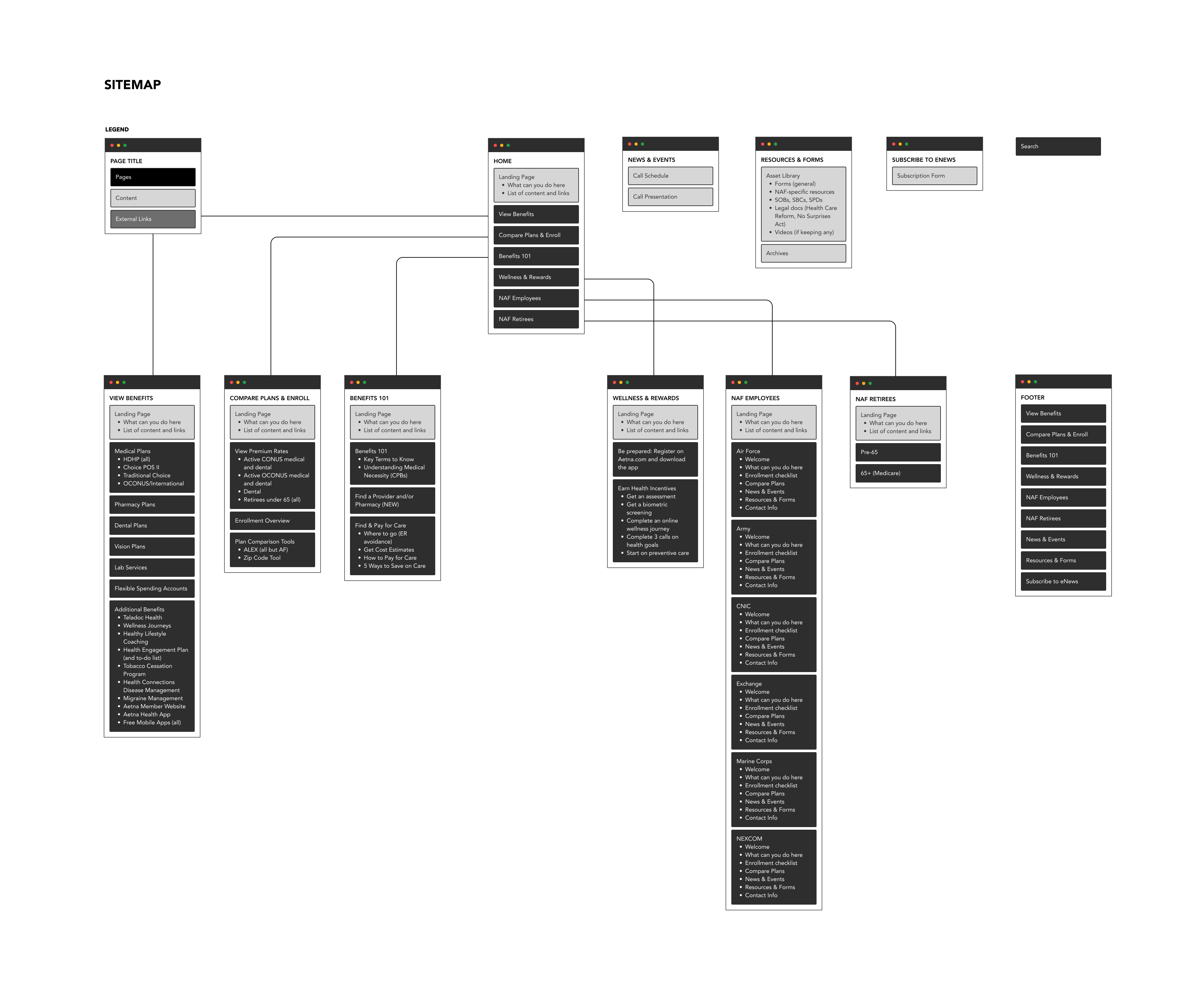
As part of a redesign initiative for the Department of Defense's Health Plans, I collaborated with Principal Designer Danielle Cerceo to improve the website’s overall user experience, making health plans easier to find and understand. As part of the initial ideation stages, I created a sitemap and content map to evaluate the structure of existing pages. Through this process, I discovered:
- Critical links and information were buried within subpages.
- Many pages contained duplicate or redundant content, making navigation confusing.
Old website:

To streamline content and improve discoverability, I worked closely with our copywriter, Laura Quaglio, to develop a proposed sitemap and content map. This structure prioritized the most relevant information upfront, ensuring users could quickly access the content they needed while maintaining a logical and user-friendly page hierarchy.

Once the proposed sitemap was approved, we moved into the design phase with key usability and accessibility goals in mind.
Given the lengthy content and diverse user needs, we focused on improving readability, navigation, and overall user experience. Some key changes we implemented include:
- Improved Navigation & Readability – Introduced iconography and accordion-style menus to help users quickly jump between sections and find relevant information efficiently.
- Approachable Branding – Incorporated white space and comforting imagery to reduce cognitive overload and make the site feel less intimidating.
- Mobile Accessibility – Ensured that all health plans were easily searchable especially on mobile devices.
By focusing on intuitive design elements and accessibility, we created a user-friendly experience that made navigating health plans clearer, faster, and more approachable for all users.
By focusing on intuitive design elements and accessibility, we created a user-friendly experience that made navigating health plans clearer, faster, and more approachable for all users.


